Showing posts with label photoshop. Show all posts

Wednesday, October 24, 2007

"THIRTEEN STEPS" PINUP


Finished coloring a pinup for my friend Kevin's comic THIRTEEN STEPS. It's a werewolf comic with some nice twists to it regarding a sort of Alcoholics Anonymous for monsters. Kevin Mellon handles the art like the champ he is, and the writing chores are tag-teamed by Phil Hester and Chuck Satterlee. I've met Chuck at a comic convention, and he's a tremendously friendly guy, but I've yet to meet Phil, though he's been one of my favorite comic artists since he was toiling away at books like THE WRETCH.

Anyway, check out the book, if you can -- it's published by DESPERADO PUBLISHING. The piece follows my standard modus operandi: pen & ink colored in photoshop. The book is printed in black and white with grayscale shading, so I did a grayscale version, though I wanted a full-color piece just for fun!

Friday, April 13, 2007

PROFESSOR SYD "SQUIDHEAD" FLEETWOOD!!


This is the mentor/ benefactor/ father figure to the group of musical heroes in my animated series concept (temporarily known as COLLIDE-O-SCOPE). This fellow's appearance is simply the result of my intention to include a wacky-scientist mentor for my heroes combined with my love for cephalopods (they just make such interesting visual playthings)!

Monday, April 9, 2007

CAPTAIN BILLY CRIBKILLER, LEADER OF THE FETAL PIRATES!


This is the final color key for CAPTAIN BILLY CRIBKILLER. Part of the animated series concept (which I think I'm going to be calling COLLIDE-O-SCOPE) I'm working on. Billy is the leader of a group of nasty little pirates called the FETAL PIRATES -- they fly around in a flying pirate ship, descending on helpless victims with the aid of their floating jellyfish placentas which they are connected to via their umbilical cords. The placentas are filled with helium gas, enabling them to float, and have additional tentacles which hold their spare weapons, reload their pistolas, and help them with tasks too difficult for their tiny fingers. Pretty bizarre, I know.

I wanted to have some sort of Pirate group represented in the series, but Pirates, as a group, seem to be getting a bit played out and old (though they'll always be cool to me). So, I began brainstorming twists I could give this group of Pirates to make them stand out quite distinctly from the norm -- zombie pirates had been done, robot pirates just seemed silly, and I'm sure someone has already done monkey-pirates. Then I thought about the tendency in animated/ commercial properties to drastically de-age a character/characters for a cheap and rather uncreative "fresh coat of paint" (i.e. Muppet Babies, A Pup Named Scooby, Tom & Jerry Kids, Flintstone Kids, Tiny Toons Adventures, etc.), and it hit me: "That's it! Take the concept of Baby Pirates and go "too far" with it -- not just babies, but fetuses! Thus, the Fetal Pirates were born. The jellyfish placentas were a solution to the problem of how a bunch of fetuses were going to get around AND handle all the cool essential Pirate weaponry. I had a sudden vision (my blessed artistic "eureka moment") of a ship full of fetuses dressed as pirates and connected to buoyant placentas floating down from the sky, and I quickly commenced sketching.

There's more Fetal Pirates to come -- after all, Billy has to have a crew to command!

Sunday, April 8, 2007

"...and his Chicken life flashed before his Chicken eyes."


Another reworked piece from a few years ago, this one featuring the imminent demise of Mr. Chicken. Pen & Ink, colored in Photoshop.

Thursday, April 5, 2007

"STOP! YOU MUST NOT HOP ON POP!"


Finished coloring my HOP ON POP piece, obviously based on the Dr. Seuss bit. This is actually a start-from-scratch redo of a piece I did several years ago. I liked the concept, but the skill in the old version was woeful and didn't hold up over time. Wanted this piece for my portfolio, but the old one just wasn't good enough anymore. Pen and ink colored in photoshop.

Friday, March 30, 2007

The O-mazing OctoPrimates!! Now in FULL-COLOR!!


Finished inking most of the character sketches for the animated concept package, and I'm in the thick of coloring them all now. First up is HENRIETTA KNUCKLES, one of the SKIDMARK SISTERS, the OctoPrimate Roller Derby team genetically engineered by Professor SquidHead (haven't finalized a good proper name for him yet) when he went through his "evil mad scientist" phase. Anyway, they're part Gorilla, part Octopus, and they can block, pivot and jam like nobody's business! More to come!

Monday, March 5, 2007

"Mmmm... MONKEY POPS!!"


This is a cereal box I designed and built for portfolio class at school. I thought the traditional "clamshell box" suggested by the instructor to house our final portfolio was a bit too rigid and formulaic for a free-wheelin' artist such as myself, so I devised this cereal box that would house my portfolio instead. It turned out to be quite the headache.

This was before I got my kick-ass large format photo printer, so I didn't have the capability to print this thing out full-size. I didn't want to chance taking it to print services at the college, so I started calling around to local print services shops (Kinkos, etc). Apparently none of them could print it out at the size I needed on the type of cardstock I needed in a decent amount of time without sending it off to some out-of-state printing facility. I decided to just print it out in two segments, then mount those segments onto cardstock with spray adhesive, cut the thing out and fold and assemble it. Easier said then done. Spray mounting two large sheets of paper and getting them to line up square is a task I don't wish to repeat. I got them down fairly well, and then let them dry.

After sufficient drying time had elapsed, I proceeded to cut the entire box shape out with a ruler and x-acto blade. With that done, I attempted to score the cardstock along the fold lines and fold it into shape for the gluing. This was made more difficult by the fact that I overestimated the stock thickness of an actual cereal box -- I had gotten too thick of a cardstock, which made folding it along nice straight lines near impossible.

Once I had it all scored and folded, I discovered it didn't quite line up right, which wasn't noticeable, except for the fact that tab on the top flap didn't extend out far enough to fit under the slot on the opposite flap. So, I rigged up a little adhesive velcro to secure the top. The end result looks nice, and I'm considering doing more cereal boxes in the future (perhaps Octo-Pops), now that I've learned from my mistakes... and I can now print the whole thing out in one piece!!

The design of the logo is based off the Kellog's Corn Pops logo, but all of the elements are created anew by myself. Even the cereal bits in the background were created by simply pouring out a box of Corn Pops onto my scanner and scanning the resulting mess (I don't recommend actually doing this, especially with your more sticky cereals). All the text is created in either photoshop or illustrator, and I simply snagged scans of my other work for the back advert, and my bananamonkey logo image for the front.

Sunday, March 4, 2007

WRASSLIN' LOVE!!


This is an image designed to accompany the short story "Charlotte" by Tony Earley. The story takes place in Charlotte, NC, and centers around a failing love relationship paralleled with the shift in popularity and loyalty from "professional" wrestling to the new Charlotte Hornets basketball team in the early 90's. The story is found in a collection of Earley's short stories titled, "Here We Are In Paradise."

It's quite a good short story and features several colorful wrestling characters -- initially, I was going to stick true to my nature and go completely gonzo-overboard with cartoony charicatures of these wrestlers in a free-for all explosion of wrasslin' madness! Perhaps mix in some fight poster elements. I may still go with this idea for a later project, but I decided to pull way back and focus instead on the doomed relationship, turning the lovers into opposing wrestlers, as their bed becomes the ring, complete with ropes and turnbuckles. Clearly, a great struggle has taken place, although no one seems to have emerged "victorious.

Setting up all the reference and deciding on a color scheme was quite a struggle, but I'm pretty happy with the end result. Pen and ink with photoshop colors.

Saturday, March 3, 2007

GO-GO KREEPS #4: SWEET-CHEE!!


By now, some of you are probably thinking I have some sort of perverse desire to harm animals based on all the amputee creatures that have made up the Go-Go Kreeps! But that's just what the Go-Go Kreeps are, baby! Just roll with it! Seriously, I love animals (except for spiders, and chupacabras).

Sweet Chee considers himself a real ladies man, yet he seems oblivious to the fact that no woman really wants to be seen with a quadriplegic ant. He lost his other four legs at the hands of Angus McMurty, the neighborhood bully, who fried them off with a magnifying glass. Sweet Chee was rescued at the last minute and, after he recovered, he was given a motor cart for handicapped ants, which he proceeded to soup-up to better "attract the ladies". Now he races around the landscape, cruisin' for chicks and layin' down hot rubber!

Pen & Ink followed by photoshop colors!

GO-GO KREEPS #3: UNCLE FIBBLE!!


This is Uncle Fibble, number three in our series of Go-Go Kreeps. Uncle Fibble is a master fabricator of "tall-tales". According to Uncle Fibble, he is responsible for Japan's surrender during World War II because he convinced president Roosevelt to drop both atomic bombs. He's also slain the Loch Ness Monster (which is why the beast hasn't been captured or photographed clearly), cautioned the other three Beatles about letting John get involved with "that tone-deaf Yoko chick", and helped build the sets for the fake moon landing recordings. Anyway, Fibble probably isn't really old enough to have done any of those things, yet, no matter how outrageous his tales, he always seems to weave them in a way that makes them seem completely plausible. He couldn't bear being cooped up in his fishbowl all day and night, so he devised and built the walking platform that carries him wherever he wants to go -- the better to spread his wisdom and tall-tales!

Pen & Ink with Photoshoppy colors!

Thursday, March 1, 2007

GO-GO KREEPS #2: BULLFROGDOZER!!


This little fella is Bullfrogdozer! Say, hi, Bullfrogdozer! Actually, you can call him Bubba-Gene. Would you like to know Bubba-Gene's story? No? Well, here it is anyway!

Bullfroggdozer (his nickname, given to him by his co-workers) was once a simple country frog named Bubba Gene, living his carefree life in the swamp and whittling detailed wooden figures for his nieces and nephews -- until his swamp home was drained and filled in to make way for the construction of a new strip mall. This strip mall happened to feature a new restaurant specializing in spicy chicken wings and frog legs -- so I bet you can guess how our friend here lost his lower limbs. After Bubba Gene recuperated from having his legs chopped off and served with watery draft beer, he decided to strike back, and had himself fitted into a "personal bulldozer" which he uses not only to get around, but also to strike back at encroaching strip malls and restaurants by bulldozing them down in the wee hours of the morning with the help of his demolition team of swamp-animal friends. On weekends, they all play together in a swamp-rock band down at their favorite watering hole.

The usual modus operandi: pen & ink with photoshop colors.

Monday, February 19, 2007

"OCTOKREEPS" ARE GO!


First in a series of wacky Octopus critters. My two favorite animals are Monkeys and Octopi -- very different animals, yet something very appealing about each. Monkeys... well, they're just plain cool. Octopi have this very alien, otherworldly quality about them, and, while their bodies are relatively simple, there's so much you can do with their tentacles as far as shape and design goes. Anyway, here's the first one. Mad Mustard is what he's called, and here's his story:

Ridiculed and bullied as a child due to his bright yellow coloration, this 8-armed cephalopod buried his fury until he developed the ability to emit low-level "anger-waves", which bolster his strength and confuse those closeby. Bullying also resulted in his fondness for cutting and striking tools, of which he can wield eight at a time with expert precision. Adopted his derogatory childhood nickname "Mustard", as a badge of honor shortly before sawing, stabbing, cutting and bludgeoning his bullies to death and deposting them in the dumpster behind the Thrift-E-Mart. Apprenticed with Dr. Hideous before joining forces with the Stilted Samurai and Jet-Pack Sumo. Last seen in Japan.

Pen & Ink drawing colored in Photoshop. Coming soon to a t-shirt near you. I liked him so much, that I featured him on the back of my business card! He's also featured over at Mojizu.com, so go vote on him right away!

PRESENTING... THE "GO-GO KREEPS"!!


Say hello to Astro-Gongg! He's the first of a series of li'l characters I'm doing called "Go-Go Kreeps". Basically, they're all bizarre or silly animals/ creatures paired with odd vehicles. I don't know why this turned out the way it did -- a quadriplegic gorilla in a motorized cart with boxing-glove mechanical arms IS pretty bizarre, but I just started doodling, and this is what came out. This guy is currently posted on Mojizu.com, so head over there and vote for him so he can be merchandised! Astro-Gongg's backstory is both tragic and silly.

Astro Gongg was one of the many secret test gorillas sent into space during the early days of the US space program. He was subjected to countless tests, simulations, experiments and enhancements. Severely injured during his last mission, Astro Gongg lost his arms and legs as a result. He was supposed to be put to sleep, but one of the scientists who felt responsible for his condition instead created a life-support system linked to a motorized cart which would keep him alive and help him get around. The rocket pack and boxing gloves are Astro Gonng's own addtions because he likes to go faster than his cart will allow sometimes, and... he just likes punching things. Needless to say, he has had quite enough of space, astronaut training and zero gravity, and wants nothing to do with the space program anymore. Still, sometimes at night, he'll look up into the night sky and remember with fondness his "glory days". Then he'll go punch something until the feeling goes away.

Pen & ink drawing colored in Photoshop!

"HELL BELOW, STARS ABOVE", VERSION 3.0 (the final edit)


Okay, I was not entirely satisfied with my last attempt at this piece, so I thought I'd start from scratch and just begin from an entirely new pose and composition. I set aside the previous attempt and begin sketching out a new basic form for the main figure. I completely redesigned his suit and weapons, and decided to remove all the lighting suggestions in the inking stage, preffering to go back in and communicate all the lighting and shadows strictly in the color stage. Whew!

To be honest, I'm getting pretty sick of looking at this thing, so this is definitely going to be my last attempt at this. I may do a similarly themed piece at some point, but I'm going to set this one aside after I'm done coloring it. I'm about 75% finished with the coloring stage at this point, so I'll post that when I'm finished.

Friday, December 29, 2006

STANLEY'S "FOAMING RAT"!!


This bizarre little ad was the result of some bored doodling at work one day a couple of years ago, and I just now got around to actually producing it. I was going through a box of notes and doodles that I had stashed away during the move back down to Florida, and I came across this beauty and decided to finish it. I really can't explain the meaning behind this or the origin of the idea -- I was bored, and somehow the image of a guy jamming a foaming pellet into a rat's ass just seemed right.

This may say something deeply twisted about me, but I'm not sure what that would be, and I'd rather not dwell on it right now. Just wait until I do the strip about Richard Dawson and Family Feud that I thought up on the same day -- I came across the notes for that, as well, and I had forgotten all about it until now. That one is pretty disturbing. Anyway, as usual: pen & ink with coloring in photoshop.

Monday, December 4, 2006

Brody Dalle


The assignment was a simple charicature/ portrait piece. Why did I choose Brody Dalle? Being the rock fiend that I was, I really wanted to do another guitar-centric piece (after my other self-portrait piece, yet to be posted here). Sure, there are plenty of interesting characters to choose from in the realm of rock, but why go for some craggy, world-weary male guitarist when I could focus on the beautiful Brody Dalle: guitarist/ vocalist for the Distillers. I think I was actually listening to the Distillers at the time, which sealed the deal, and the not-unpleasant search for reference pics began.

As you can see with the original sketch, I intended to have a larger head and shoulders portrait next to the figure shot, but it just didn't seem to fit. The "living dragon tattoo" idea may seem a bit cliche, but I became so enamored of this lovely, detailed twisting dragon tattoo on her arm that I figured if I was going to put the time and effort into all those scales and fins, I was going to make it count! Plus, I couldn't settle on a visual shorthand for the tattoo detail, and it wouldn't work to include such detail in a tatto that would have been rather small and not the focus of the piece. The solution: grow that tattoo out and go to town on it! I like the underlying drawing, but I'm not 100% satisfied with the color final. I think I managed to keep the dragon tattoo from overpowering Brody herself, but the background seems a bit rushed and uninspired. Deadlines forced my hand, but I may go back and fiddle with it some more later.

Pen & ink with photoshop.

Thursday, November 30, 2006

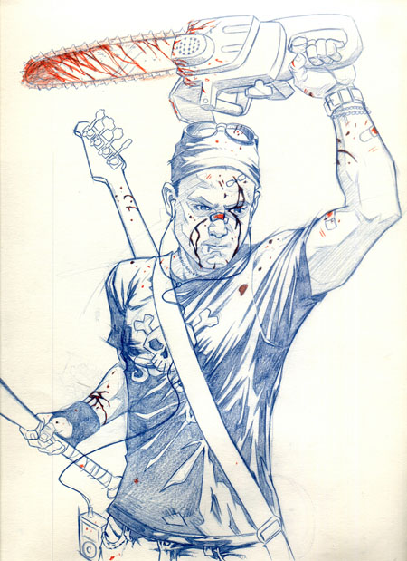
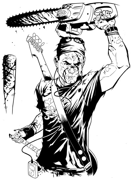
The Lonely Zombie-Hunter


It's time to create the senior illustration poster, which involves everyone in the illustration department's senior class to contribute a self-portrait, all of which will soon be compiled and formatted into the senior illustration show poster early next year. My advanced illustration class had the bright idea to do a sort of "Brady Bunch" style block where all of our portrait blocks would be placed together and we would all be interacting with each other in various cute and wacky ways.

My square was to be diagonal from another classmate who had become a slobbering zombie, thus, I became a zombie-hunter -- grim and blood-splattered, wielding a well-used chainsaw and baseball bat with by bass guitar slung across my back and zombie-killing music playing in my ipod headphones. Well, the idea got nixed, of course, but the drawings I had already done were just too good to leave by the wayside, so I finished the piece anyway, despite it making me look like some extremely antisocial serial killer. I'm not sure if I'll use it for the senior poster (I've already drawn up an alternate idea which involves considerably less blood), but I thought it made a decent stand-alone image nonetheless.

Pencils, finished inks, and "final" photoshop image (I may not be done fiddling with it yet).

Sunday, November 12, 2006

Pop-Monkey enters the blogosphere (or whatever the cool kids call it)!


Well, well well... I guess it's time to bite the bullet and give in to the siren song of modern technology! It's blogging time! I used to ridicule the folks who thought themselves so self-important that their every thought was worth posting on the internet for all to see. But, when it comes to the self-promotion an artist must engage in, web presence is a must -- and, since I'm too dense when it comes to web-stuff to make my own website right now, a blog will have to do for now.

I'll be posting works-in-progress, from sketches to finished pieces, on this page, as well as random other stuff that I need to express to relieve the pressure on my poor poor brain. I don't sleep much these days, so don't count on coherent or intelligent musings about the state of our world. I would love to write a better introductory post to kick things off, but you don't care what I have to say, and I have work to do anyway. So, here's a few introductory sketches to get things started! Enjoy! Opinions, criticisms, and job offers are always welcome.

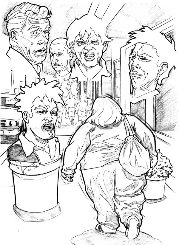
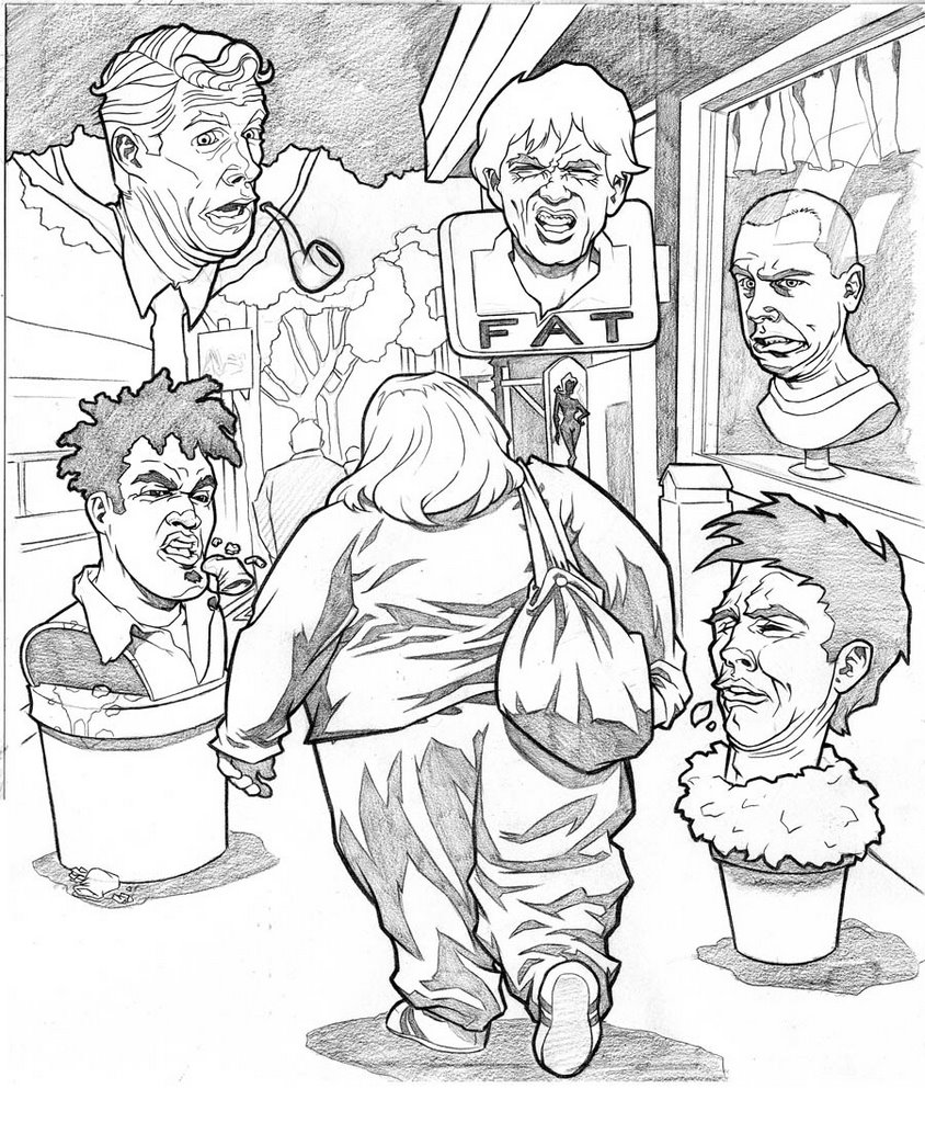
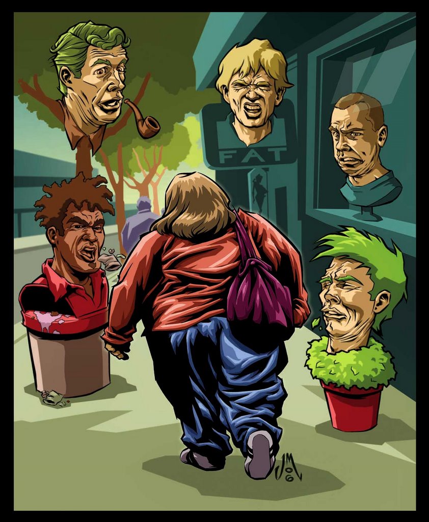
These images are for an illustration to accompany a poem about being fat. Both the name of the poem and the author escape my mind right now -- I'll add them later. First is the initial sketch: I had envisioned a montage of disgusted faces hovering around the obese woman as she walks down the street. Later, I decided to merge the faces in with the surroundings, so it wouldn't seem so "floating heads". The end result might be a tad too humorous for the tone of the poem, but I'm fairly happy with the final result. I inked the woman and the heads and colored the whole thing in Photoshop.