Friday, December 29, 2006

"HELL BELOW, STARS ABOVE" Part 1


This image is the result of an idea I'd been fiddling with for some time. The concept was borne when I realized that one of my favorite bands from the 90's THE TOADIES had actually released a second album several years ago that I knew nothing about. I immediately begin my search for the album to purchase it and the title of said album turned out to be... you guessed it: HELL BELOW, STARS ABOVE. Before I even got a hold of the album (purchased off ebay), I fell in love with that amazing title. Having not heard the actual song on the album of the same name, my head started conjuring up noble and pulpy images of a heroic astronaut/ space explorer stranded on an hostile alien world, on his last legs and overrun by swarming alien hordes crawling up from the depths of the rocky planet as he makes his last desperate stand on a rocky peak, laser guns blazing, suit in tatters, determined to take as many of the monsters down with him as he can. Wow. I immediately set to laying out an illustration based on these drawings. The result was compositionally nice, but poorly rendered. Something just wasn't being ignited in me that would enable me to really give it the juice. The song itself, once I heard it, has nothing to do with brave astronauts or teeming alien hordes, but is rather about the victim of a failed relationship confronting his ex with her "other man". It's a brilliant and moving sonic gem, and has become one of my favorite songs of all time, but it nothing to do with this image it has indirectly inspired.

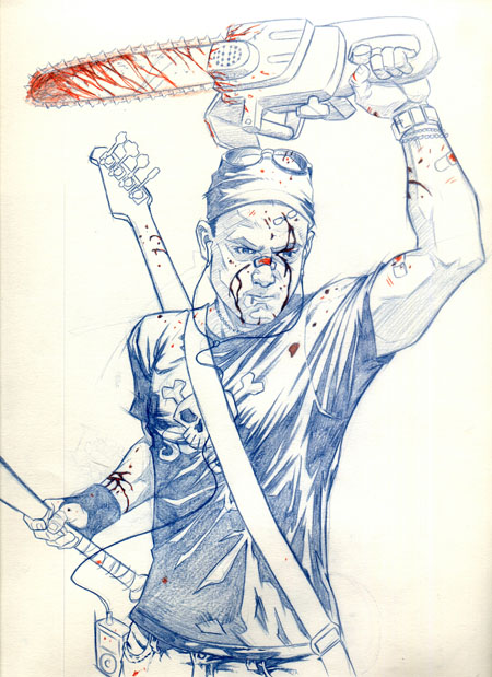
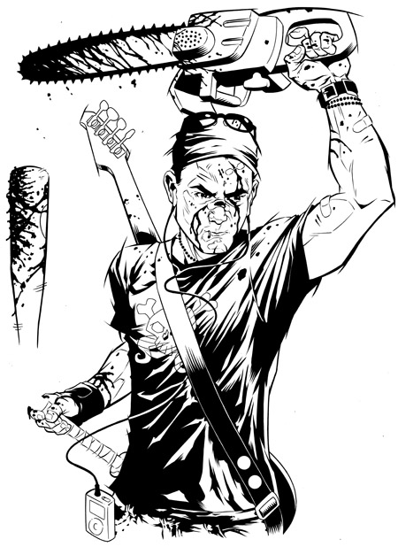
Over the past year, I have reworked and redrawn this image several times. The astronaut's suit started out as very simple, but I've added a bit more detail with each run I've taken at it. I've also intensified the facial expression a bit more and just generally beefed up the linework and detail. I had originally drawn a piece that had very little lighting and shadown cues in the inking, thinking I'd handle that in the coloring stage, but I decided to go with a more E.C. Comics pulp vibe and really capture the lighting scheme with some more intense inking, allowing it to stand alone as a black and white piece.

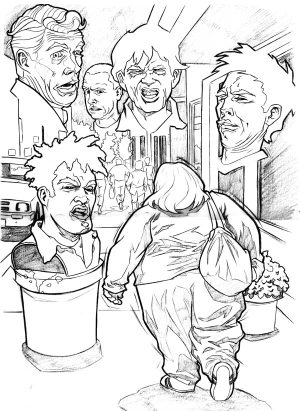
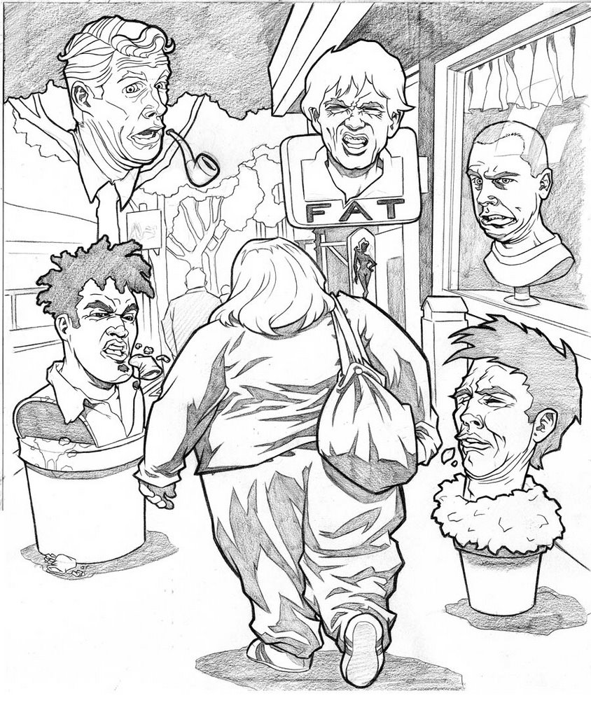
During the course of the school year, one of our Advanced Illustration projects called for us to do an advertisement poster for a charity. Having fallen a bit behind in that class, I decided to truncate the conceptualization stage and use this image to represent the Comic Book Legal Defense Fund charity. It seemed to fit, thematically, with the underdog fighting tooth and nail against those that seek to "opress" him, so I decided to use it. So, I set about completely starting over with the image and redrawing it from the ground up. In the past, I'd just set the image on my light box and go over it with more detail and whatnot, but this time I decided to start completely over from a new rough layout, not only so I couldn't be accused of using an old, already finished piece for my project, but because I really wanted to knock this one out of the park, and this was a great excuse to start over.

I finished the clean-up pencils and began inking, but about halfway through my teacher mentioned I should submit this to the annual SPECTRUM competition when I was done. This sort of spooked me, I guess, and I realized that, while the pencils I had done were pretty solid and satisfying, the inking was not my best work. And so, I started over, yet again, having to re-pencil the entire thing. This time, I allowed the pencils to remain a little bit more loose than they were before, allowing me to be a bit more spontaneous and expressive with the inks. I'm quite pleased with the results. I had started coloring the piece to turn in (late), but having spent so much time on the piece already, the coloring job turned out to be rushed and lackluster. So, I'm starting over with the coloring stage. I may stay fairly monochromatic with it, but I'm not quite sure yet. Final color post will follow, as soon as it's done.

STANLEY'S "FOAMING RAT"!!


This bizarre little ad was the result of some bored doodling at work one day a couple of years ago, and I just now got around to actually producing it. I was going through a box of notes and doodles that I had stashed away during the move back down to Florida, and I came across this beauty and decided to finish it. I really can't explain the meaning behind this or the origin of the idea -- I was bored, and somehow the image of a guy jamming a foaming pellet into a rat's ass just seemed right.

This may say something deeply twisted about me, but I'm not sure what that would be, and I'd rather not dwell on it right now. Just wait until I do the strip about Richard Dawson and Family Feud that I thought up on the same day -- I came across the notes for that, as well, and I had forgotten all about it until now. That one is pretty disturbing. Anyway, as usual: pen & ink with coloring in photoshop.

Monday, December 4, 2006

Brody Dalle


The assignment was a simple charicature/ portrait piece. Why did I choose Brody Dalle? Being the rock fiend that I was, I really wanted to do another guitar-centric piece (after my other self-portrait piece, yet to be posted here). Sure, there are plenty of interesting characters to choose from in the realm of rock, but why go for some craggy, world-weary male guitarist when I could focus on the beautiful Brody Dalle: guitarist/ vocalist for the Distillers. I think I was actually listening to the Distillers at the time, which sealed the deal, and the not-unpleasant search for reference pics began.

As you can see with the original sketch, I intended to have a larger head and shoulders portrait next to the figure shot, but it just didn't seem to fit. The "living dragon tattoo" idea may seem a bit cliche, but I became so enamored of this lovely, detailed twisting dragon tattoo on her arm that I figured if I was going to put the time and effort into all those scales and fins, I was going to make it count! Plus, I couldn't settle on a visual shorthand for the tattoo detail, and it wouldn't work to include such detail in a tatto that would have been rather small and not the focus of the piece. The solution: grow that tattoo out and go to town on it! I like the underlying drawing, but I'm not 100% satisfied with the color final. I think I managed to keep the dragon tattoo from overpowering Brody herself, but the background seems a bit rushed and uninspired. Deadlines forced my hand, but I may go back and fiddle with it some more later.

Pen & ink with photoshop.

Thursday, November 30, 2006

The Lonely Zombie-Hunter


It's time to create the senior illustration poster, which involves everyone in the illustration department's senior class to contribute a self-portrait, all of which will soon be compiled and formatted into the senior illustration show poster early next year. My advanced illustration class had the bright idea to do a sort of "Brady Bunch" style block where all of our portrait blocks would be placed together and we would all be interacting with each other in various cute and wacky ways.

My square was to be diagonal from another classmate who had become a slobbering zombie, thus, I became a zombie-hunter -- grim and blood-splattered, wielding a well-used chainsaw and baseball bat with by bass guitar slung across my back and zombie-killing music playing in my ipod headphones. Well, the idea got nixed, of course, but the drawings I had already done were just too good to leave by the wayside, so I finished the piece anyway, despite it making me look like some extremely antisocial serial killer. I'm not sure if I'll use it for the senior poster (I've already drawn up an alternate idea which involves considerably less blood), but I thought it made a decent stand-alone image nonetheless.

Pencils, finished inks, and "final" photoshop image (I may not be done fiddling with it yet).

Sunday, November 12, 2006

Pop-Monkey enters the blogosphere (or whatever the cool kids call it)!


Well, well well... I guess it's time to bite the bullet and give in to the siren song of modern technology! It's blogging time! I used to ridicule the folks who thought themselves so self-important that their every thought was worth posting on the internet for all to see. But, when it comes to the self-promotion an artist must engage in, web presence is a must -- and, since I'm too dense when it comes to web-stuff to make my own website right now, a blog will have to do for now.

I'll be posting works-in-progress, from sketches to finished pieces, on this page, as well as random other stuff that I need to express to relieve the pressure on my poor poor brain. I don't sleep much these days, so don't count on coherent or intelligent musings about the state of our world. I would love to write a better introductory post to kick things off, but you don't care what I have to say, and I have work to do anyway. So, here's a few introductory sketches to get things started! Enjoy! Opinions, criticisms, and job offers are always welcome.

These images are for an illustration to accompany a poem about being fat. Both the name of the poem and the author escape my mind right now -- I'll add them later. First is the initial sketch: I had envisioned a montage of disgusted faces hovering around the obese woman as she walks down the street. Later, I decided to merge the faces in with the surroundings, so it wouldn't seem so "floating heads". The end result might be a tad too humorous for the tone of the poem, but I'm fairly happy with the final result. I inked the woman and the heads and colored the whole thing in Photoshop.