Friday, January 30, 2009

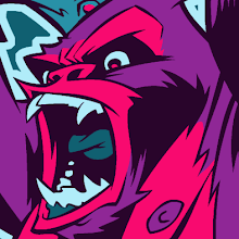
SUPAH SYBORAH!


Another quick character design. This one is from the Kaiju concept that's been rattling around in my head for some time now. I love Kaiju, and I've got a small notebook devoted to notes and scribblings for a massive giant-monster themed project that I've been slowly adding to for the past couple of years. Anything involving Kaiju needs to be given at least a bit of the tongue-in-cheek approach. Treating it too seriously often results in disaster as happened with Emmerich and Devlin's American GODZILLA, although that could be blamed solely on them being plain bad filmmakers. CLOVERFIELD showed that it can be done completely seriously, however, as did the original GODZILLA, but I think those instances of success are few and very far between. The most far-out crazy treatment of the subject, I think, can be found in the wonderfully fun and intentionally hilarious KAIJU BIG BATTEL. KBB's giant monsters appear as brilliantly-costumed wrestlers beating the parts off each other amidst foamboard skyscrapers. I've had the pleasure of attending one of their live matches and it was sheer bliss.

Anyway, I haven't yet decided where on the Kaiju spectrum I want to seat my project. It's not going to be CLOVERFIELD-type storytelling, but I may not want to go quite as ridiculous as KBB. We'll just have to see where this takes me. I'll be digging out more character sketches as I go and fleshing out some of the beasts and monsters bit by bit. This guy is named SUPAH SYBORAH, and he's basically the JET JAGUAR (or ULTRAMAN) of my Kaiju universe. Who is JET JAGUAR, you ask? He's a human-sized robot that can grow to monster-size to battle alongside (or against) Godzilla. That's all I've got to say about him for now. More later!

WRESTLE SPROUTS!


These are a couple of quick character designs for something I've got stewing in the back of my head. All I know is that it's focused at children and it's somewhat nutrition-based. Since my wife got her job working for the local hospital's "healthy kids" program, I've been thinking about some sort of imaginative children's concept that promotes healthy living without resorting to the sort of brainless, ham-fisted conceptualizing that usually accompanies that sort of thing (y'know, where there are bad guy characters who are invariably anthropomorphized soda pops and candy bars and the fearless good-guy in a ridiculous costume always gathers the kids around in a huddle to hammer home the importance of exercise and good nutrition as they nod and feign excitement). I want to be a bit more creative and far-out in characterization and plot, staying far away from anything so obvious as to get in the way of the enjoyability of it all. Kids aren't stupid, after all (well, most of them anyway), and they can smell something designed by men in suits to push a "message" a mile away.

All I know about these characters so far is that they're part of a wrestling troupe called the "Wrestle Sprouts". I came up with the name while eating brussel sprouts and ruminating about wrestling. Aren't I clever?

MARIO!


Here's a quick peek at Mario for my second DONKEY KONG illustration, currently in-progress!

Thursday, January 29, 2009

SNEAK PEEK AT "DONKEY KONG" COLORS!


Howdy, folks!
I'm in the thick of coloring my first DONKEY KONG piece, trying to fit it in between a few freelance jobs and other odds and ends. It's progressing quite smoothly and I thought I'd share a peek at it with you to fill in the gaps in my posting schedule.

Friday, January 23, 2009

"KEEP ON WANGLIN'" SHIRTS 'N' STUFF AVAILABLE NOW!


I finished coloring this design a while ago, yet somehow neglected to post it here. Ah, well. The design is based on Robert Crumb's famous "KEEP ON TRUCKIN'" design, and is now available at my CafePress shop on a multitude of clothing, button and miscellaneous other items (you know your dog wants a Wanglin' shirt).
If you like ridiculous pink squids that seem to be stuck in some sort of 70's timewarp, then follow the link and buy yourself a shirt or two!

Merchandise includes, shirts (sleevy and not-so-sleevy), sweatshirts, hoodies, buttons, apron, thong, boxers, mousepad, onesie, bib, dog-shirt, tote bag, messenger bag, mugs, steins, coaster and throw pillow. I know... it's shameful.

Thursday, January 22, 2009

DONKEY KONG inks!


Finally finished the inks for my first DONKEY KONG piece. I wish I had a larger scanner. I had to ink each element on separate sheets of bristol (DK, Mario, Pauline, the girder) and scan them individually, then piece them together in Photoshop. I think my scanner is wearing out, too, because it seems to be starting to slightly distort each scan so it's not as easy to get scanned elements to fit together anymore. Oh well... gotta have money for a new scanner, and that's not happening right now.


Colors will follow soon!

BATMAN'S "SCARY VOICE" COSTS FILM OSCAR NOMINATION!

Well, the Oscar nominations are out, and, much to the surprise of many hopefuls in the comics community, THE DARK KNIGHT did not get nominated for Best Picture, though it did appear in many other categories (and Heath Ledger did secure that Best Supporting Actor nom). Despite the fact that I didn't think the film quite deserved getting a Best picture nomination, you know what I think was the one major detracting factor that prevented a Best Picture nomiation? Christian Bale's ridiculous "scary-Batman" voice.

Seriously, it was over-the-top, mostly indecipherable and laughable. Was the director simply too intimidated by Bale to not pipe in almost immediately and say, "Uh, Christian... no, that's not gonna work. Do you maybe need a throat lozenge or... no? You meant to do it like that? Okay, yeah, that's not gonna work. Let's try something that's nothing like what you just did. Remember, this is a serious movie, not a comedy, and folks need to be able to understand what you're saying."

This better get cleared up for the inevitable sequel.

Tuesday, January 20, 2009

HELL BELOW, STARS ABOVE inks


Finished inking the HELL BELOW, STARS ABOVE piece. Proceeding with colors...now!

Thursday, January 15, 2009

"CARRION, WAYWARD SUN" take two


Another item on my "finish it off already" list, this is the revised drawing for my CARRION, WAYWARD SUN t-shirt design. As usual, I dug out the old unfinished design and deemed it below my current skill level. It needed to be pushed further and tuned up, so that's what I did. I originally had a more stark and pure beam of light blasting forth from the sun's mouth, but that seemed too rigid and cold, so I changed the moon-blasting radiation to more of a liquid fire look. Also curled the sun's beams just a bit to give it a bit more of a dynamic sense of direction. I'm quite happy with this one, and I fully intend to finish this one off and have it on some shirts at my CafePress store before I get the desire for another "do-over". Inks and colors soon to follow.

Just as a note, back when I first conceived this design and coined it's name, I put the phrases "Wayward Sun" and "Carrion, Wayward Sun" in my google alerts, which I often do to see if anyone else has thought of the name or is using it in a similar fashion. The only hits I've really gotten so far are from people who simply misspell the lyrics from the Kansas song from which the title is derived ("Carry On Wayward Son"). Instead of "Wayward SON", they believe it to actually be "Wayward SUN", which doesn't make any sense if you listen to the song's lyrics.

Wednesday, January 14, 2009

"HELL BELOW, STARS ABOVE" -- the final pass, I swear it!


A big part of getting back into the swing of things is going through my rather large backlist of personal projects that have been started but never finished. Call it my "new year's resolution", if you will. I started going through my files of in-progress work and was stunned at how many ideas I had been tinkering with or nearly-completed but then abandoned either due to freelance work monopolizing my time or just from setting the thing aside and forgetting about it. Going through a housing move recently didn't help either, as all the stuff I had strewn about in my work-pile got packed away and fell victim to the out-of-sight out-of-mind rule.

Anyway, this is something that's been in-progress for far too long. It's time to polish this thing off once and for all, but not before retouching it a bit. A big problem with setting something aside for so long is that, inevitably, when I come back to it I'm not at all satisfied with how it looks or (perfectionist that I am) I simply look at it and think "I can do better". Actually, that may not be such a bad thing. Sometimes an artist can benefit greatly from stepping away from a piece for a while and coming back to it with "fresh eyes". That's a big part of the reason why I don't like to rush my illustrations and let them progress at a natural pace. Unfortunately, if I take too long on them, or rushed them in the first place, I usually just want to redo the thing 4 months later!

It's always good to have a few projects going on concurrently. This keeps things fresh and allows you to jump back and forth at your leisure, and keeps a piece (and your interest in it) from stagnating. I'm always doing this, but I think I've taken it to ridiculous extremes by allowing my backlog to bloat to an overwhelming size. I made a list of all the illustrations and personal projects I have in various stages of completion and there are about 30 items on the list (and I know I'm still forgetting some). So, while it's very hard for me to promise that I will not begin something new before finishing off the old stuff, I can at least try to complete 3 new illustrations before beginning one new one. Hopefully I can whittle this list down within the next few months and build up my portfolio nicely in the process.

Currently, I'm in the midst of inking this thing, as well as the first DONKEY KONG piece, as well as reworking the final revision pencils for both the UGLY STICK and CARRION, WAYWARD SUN t-shirt designs. Also tightening up the final drawing for the second DONKEY KONG piece. More updates soon!