Showing posts with label ugly stick. Show all posts

Friday, March 27, 2009

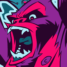
"UGLY STICK" design up for vote at THREADLESS!

Hey, my UGLY STICK t-shirt design is up for voting over at THREADLESS.COM!
Stop by and cast your vote so this puppy can be printed and available for ugly people all over the world to wear proudly (note: you do not have to be ugly to wear the shirt). If you don't have a Threadless account, go ahead and create one, and commence voting! Be sure to leave a comment, as well, and articulate your desire for either red or gold. Thanks for your support!
My Threadless.com Submission


Friday, March 20, 2009

"UGLY STICK" Shirt Design Placement

Here's a little mock-up I did to show the placement of the design on the actual shirt.


This is not a guarantee that you will be struck by a moving vehicle if you wear this shirt, so don't come cryin' to me when you walk around unscathed while sportin' the UGLY STICK...

Thursday, March 19, 2009

"UGLY STICK" Shirt Design final colors!


Finished fiddling around with some color schemes for the UGLY STICK t-shirt design. This is one of those things where I come up with a fake band name I think sounds cool and then design their logo and a t-shirt or two (there are many more of this type of thing in the works). This is a reworking of a concept I had come up with a couple years ago which was in dire need of redrawing. I actually did the first pass as part of a project for my junior year at art school. I went back and looked at that early attempt and I was horrified at how bad it was! It's good that I can see a definite progression and advancement of my skills and capabilities, but I wish someone had told me back then just how bad I was! It's embarrassing!

I came up with 5 different color schemes for this, which may be overkill. The yellow one was the inital design, and I definitely think it's the strongest. The rest are just further variations I did due to being somewhat unsure if I'd nailed it with just the yellow. The yellow, turquoise and red shirts feature 4-color designs while the 2 taupe variations feature 5-color designs.

What does anybody else think about which ones work and which ones don't? I'll end up submitting whichever one I feel most comfortable with (after walking away from these for a day or two) to a t-shirt design site or two and see if there's any takers. Feedback is appreciated.

Sunday, March 15, 2009

"UGLY STICK" inks


Just finished inking my UGLY STICK t-shirt design. As with most of my work, the pencils have been printed out as a blue-line image on bristol board and inked with about 95% brush and ink and 5% pen.

For inked illustrations, I'll sometimes ink a separate color-hold layer to use as a map for the flat shading and/or highlighting. This is a scan of the shading inks for this piece...


This gets scanned in and layered underneath the lineart, like so...


It gives me a nice hand-drawn lighting template so I don't have to mess around with lassos and paintbrush tools quite as much and it prevents the whole thing from coming off as "too-digital".

Preparing to scan and color right now. More soon!

Friday, March 13, 2009

UGLY STICK!


Got some exciting things coming up, but for now, here's the revised and finished pencil drawing for the UGLY STICK t-shirt design in progress. Inks and colors soon!